
I'm pleased to announce that I have started my own little company - mare ad mare, which is latin for 'sea to sea' and part of the Canadian motto (check the cover of your new passports). Our goal will be to build a fresh new brand of clothing for Canadian (and wannabe Canadian) girls. I will be using this blog, much as I have in the past - to continue showing people around the globe (over 50 countries now!) what it's like to be a Canadian girl, tracing the footsteps of our 3 girls as we explore more of this great place we call home.

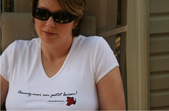
'Gimme a little kiss' - says it all. Now for big girls! Check www.mareadmare.ca for more details. All designs copyright of mare ad mare.

A big pile of leaves for you here! As a Canadian summer turns to fall, the leaves change colours and then fall off the trees. Kids rake them up and play! So go on, Jump into Fall with this Orange T. Check www.mareadmare.ca for more details. All designs copyright of mare ad mare.

Summer in Canada is the time for camping, camp fires and of course - Marshmallows! Get ready to go roast some in this summer yellow T. Check www.mareadmare.ca for more details. All designs copyright of mare ad mare.

After a long Canadian winter, spring can never arrive too soon! Pull on this Spring Green T and go planting girls! Check www.mareadmare.ca for more details. All designs copyright of mare ad mare.

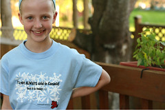
How many times have you had to tell someone that it's not always cold here? Well, sometimes it is cold - but to make your point, grab this little winter blue T and let them know that it's not just snow and ice up here all the time! Check www.mareadmare.ca for more details. All designs copyright of mare ad mare.

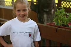
'Gimme a little kiss' - says it all. Girls, grab this little white T, and go get your kiss ;-) Check www.mareadmare.ca for more details. All designs copyright of mare ad mare.


I love the winter shirt, as well as the "Give me a kiss" shirt, and would totally order some (if I had a little girl to put them on!) Great job!
Thanks! Maybe I should make a few in big girl sizes ;-)
I like the butterfly off to the side in the last shirt. It could be like that in all the shirts? I agree about the orange and the green colours being too vivid. A mint green is good for spring or even pale yellow. Fall could also be brown or beige. I like how the winter one isn’t just a big rectangle. Summer needs a beach scene, I think. It’s all very clever – but I think I like the white one best of all. It’s clean and simple and not just because of the white.
Thanks XUP, that's a good idea (off to the side...) I'll play with it a bit, see how it works. The girls really liked it for the blog header - so great minds must think alike ;-) (Theirs and yours that is... definitely not me!)